Friday, 23 October 2015

Week 3-Viking Hand in

Name: Sarah Wright
P Number: p1322992x
Email: p1322992x@email.dmu.ac.uk
Project Title: VS- Partially Stylized Character Project

Overview: To produce semi-stylized Viking characters based on the artwork of JC Leyendecker. The lead character is going to be a spritely young girl, with a collection of supporting characters from her village, and enemy characters. For this project I produced a main character 3 support character one main Enemy character and 2 lower enemy characters as well as promotional images.

The process for this included:
  • Researching and studying Leyendeckers’ work specifically his style of rendering. 
  • Finding "modern day Vikings" to bas my characters faces and body types on 
  • Researching Viking Clothing 
  • Sketching out my collection of characters 
  • Preparing my characters for colour and exploring pallets 
  • Producing final renders. 
Research/Mood boards:


Thumbnails:
A few sketches to get a feel for the characters I wanted to produce, in response to my Viking mood board.

Further Character Iterations:


Design Evaluation:


Colour research/thumbnails
I began this process by creating clown renders of my characters, from there I base my first pallets off the colouring in my Viking clothing mood board. After some feedback it was suggested that I take inspiration from Leyendecker for my colour choices. So I made a reference sheet of hero and villain images that I could extract my pallets from, this worked very well and I'm pleased with how the final pallets turned out.


Rendering Studies:
​Noting down the materials present in my character designs and studying how Leyendecker renders these.


Final Character Sheets:


Render Crib Sheet:
This was created in response to feedback, it was suggested to me that I put all the reference I needed for my more polished outcomes onto one sheet, so I did not lose sight of the Leyendecker look I needed to stick to.

Hel Character Exploration:


Composition thumbnails and Polished Promotional Images:


Evaluation Q&A

Q: Did I answer the brief?
Not particularly, in trying to hit the quantity of characters needed for the brief I missed out when it came to rendering them all in a Leyendecker style. I plan to put my characters back in the context of Leyendecker’s work when I revisit this project.

Q: How well did I mange my time
Pretty well. I ran out of time to polish some of my characters, but I can make that up at a later point. I feel like my hero designs are fairly strong though. However because I'm not used to the level of characters I had to produce I had to skip some iteration when it came to designing my enemy characters, and overall rendering time was cut. For future project I'll need to cut down the steps I usually take when producing designs.

Q: Did my end result represent what I wanted for this project?
Yes, I produced the quantity of characters I needed for this project, and I am happy with the designs of the majority of them. When it comes to the level of polish I wanted I didn't quite hit that, but that’s a matter of time rather than ability. 

Q: Strengths I found during this project
I was more efficient and organised in my process than I normally am. I'm used to creating one character at a time so I gave myself several opportunities to evaluate and check my characters against each other to make sure they all fit as a group, which helped me produce some solid designs.

Q: Weaknesses I found during this project
Trying to render my characters in the style of Leyendecker was an issue throughout this project.
Q. What stressed me out the most during this project?
The quantity of characters threw me when it came to cleaning them all up to an intermediate level.

Conclusion:
Overall I love how the main character and Hel turned out. Though I fell a little short on time to develop my enemies my hero characters worked out great this project.This project may not have turned out as polished as i'd like, i can see where I can develop this and improve upon it. Also how I can mold this to better fit into my portfolio. So that’s a win for me.

Saturday, 17 October 2015

Week 2- Character Creation

Since I was all over that place last week I took so time to go through and plan the rest of my project, with daily goals (written and ticked off on my many post-it notes)


 I started going through the motions without much of a hitch.

More Shield maiden designs closer to the end I decided to make her a Blacksmith character as well. The hair over the eyes was a happy accident that amplified the gruff  intimidating look I was going for.

Main Character designs. I'm choosing to develop the far left design

Main characters father

Swords-woman character, Married to the archer, looking after the main character

With my 5th character I came to a bit of a dilemma with his size. Originally I was gong to have him as a tall lanky, slightly hunched character to match his wife, however when testing this in a character line up  I changed his original size to better balance out the group. The contrast between the Archer and the Swords-woman also worked out in my favour.


checked the size difference with a character line up
Archer Designs
At this point I evaluated my designs and went through any changes that were needed. Some  structured self crit is good when I have something almost locked down.
Evaluation
After tweaking I did another arrangement similar to the composition I noted down last week, and took some notes, with the majority being about poses rather than design.


Now that I had my heroes more or less locked down I went back to dissect Leyendecker's style as that stumped me last week. I decided to do a few  material studies from his work, I first wrote down what type of materials I'd need to render for each character (the main ones being skin, hair, cloth, leather and metal). After I'd found examples of these in Leyendecker's work, I tried to reproduce the rendering style. I found that I can produce something similar to Leyendecker through texture effects when it comes to materials. When it comes to faces I'm stuck between using Leyendecker's softer style he used to paint woman, and his angular style that follows the planes of the face very closely.

Study sheet
Mid week I went onto the enemy designs. I decided on having Hel, ruler of the underworld in Norse mythology  as my main bad guy. I noticed Leyendecker's women have what Andrew Loomis described as "heroic proportions" that is they are generally 8-9 heads tall. So I made sure to reflect that in Hel.


Hel is also described in several ways: 

So I tired out a few looks, because I wanted her to be closer to Leyendecker's glamorous models I did not depict her as a hag, and later on also threw out the idea of having half of her undead. Instead to reference her original description of being half alive with the lower half of her skeletal, I drew her with body-paint depicting a skeleton to represent her half dead form.

The  lower enemies were fairly quickly sketched out as I realised I have little time left in my schedule so the have only the one main iteration. I wanted a small, medium and large damage dealing enemies, so I settled on these three, A large tank like Viking. A berserker witch, and a quick vicious wolf.


I also lined these characters up like the heroes for to test how they looked together. I found that Hel needs a new pose to better show her flamboyant character (time permitting) . The wolf  also needs work as well as the berserker (his shield's perspective is off).


To finish off the week I've been going through my Hero character designs, cleaning up their lines and doing clown renders ready for colour.

Blacksmith clown render with and without lines

Archer Clown Render

Swords-woman clown render. I also changed the look and pose of this character in response to self-evaluation

I'm very happy with how this week turned out as I completed all of my designs like I set out to do. My main concern now is getting everything done and polished in time, as I did rush a bit with the enemy designs so I don't want that to come back a bite me later on.

My goals for next week:
  • Finish the clean up and clown renders of all characters.
  • Decide the colour/materials of my characters.
  • Render basic lighting for character sheets.
  • Thumbnail and produce a promo piece. 
  • Present everything ready for hand in.

Monday, 12 October 2015

Week 1- Dawn of the Post it Notes


It Begins

To kick start this project I thought it best thing to research Leyendecker and his work. Luckily there is a Leyendecker book ((J.C. Leyendecker by Laurence S. Cutler and, Judy Goffman Cutler, pictured above) in the library filled with almost all of his work.

On the way there I also thought of a rough story for the characters I'd need to design. As a rough idea the main character has recently lost her father and is on a journey to retrieve him form "Hel" (The underworld in Norse mythology, the ruler of Hel also shares its name) going through several enemies such as Logi, his son Loki, and his children.She is joined by the couple who now look after her and they pick up a few other party members on the way. I also had a nice image of a rough idea for a promo image pop into my head on the way back from the library.


Finding a story to place theses character in is important to how I work, so I'm glad to have locked that down on the first day. I've found I struggle to  make successful characters without being able to think out their story and their relationships with each other in my head.

I made some rough goals detailing what I want out of this project. to keep me focused.

  • Mix Leyendecker style of rendering with my own stylistic way of sketching characters. 
  • Be consistent ad efficient with my work process when creating many characters.

I'm used to creating one stand alone character at a time so this  project will be a challenge for me. Figuring out how to produce many character in the same world, link them all together and render them to the same point, is something I need to work on. For example with my last character sheets I had the ideas for more characters, but ended up not designing them after the first. this project will force me to do so, and hopefully give me some energy to be able to go back to my unfinished projects.


Example: The Ringmaster character for a circus I still need to design 
After going through Leyendecker's work and organising it I picked up a few things:
  • Leyendecker's character are very glamourous, he more or less was the pitoeer of morden advertising and the notion the "sex sells" It'll be difficult to convey that glamour to Vikings.
  • Most of his images have a basic lighting set up, with a key light and strong back/rim light.
  • His figures tend to have strong angular shadow shapes.
  • Leyendecker drew from live models almost exclusively.
  • He used a pencil grid to the transfer his work onto a bigger scale.
  • The brush strokes and canvas texture are evident through his work.
  • He's a fan of rosy cheeks on his models.
  • The men are generally muscular, angular and stoic with the woman being more flamboyant and soft (though there are examples both being drawn in the other style.)
  • Bold outlines are  often used to frame his figures.
  • There's a limited pallet to most of his work.
  •  Leyendecker used brush strokes to give his work a "hatched" look.

Unfortunately after this  I had found that I was stuck, I had no idea how I was going to replicate this style as it was so far from what I am used to doing, so I left it and focused more on the Viking half of the brief. First researching Norse mythology and potential enemies for my Vikings to fight:
potential enemies list

I also looked into Viking clothing and armour, I found that most of these outfits are layered with cloth and fur being the main components in plain cloths, and leather and chain mail being main components in armour. There was no medieval type heavy armour for the Vikings :

Clothing mood board 
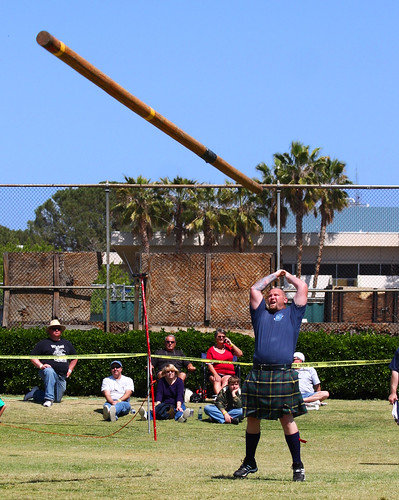
For the characters themselves, I wanted them to keep them varied in body shapes and face type, whilst still looking very much like Vikings.So I asked myself who would be considered modern day Vikings? My first thoughts went to the highland games, (especially the caber toss), then onto the worlds strongest men, then athletes and weightlifters in general. I came out with real people with varied features, still in a peak level of physical condition that would be needed to survive as a Viking warrior, (as my initial idea was to have them all as fighters, in an action RPG type game). though now I'm thinking of making a few shopkeeper and villager NPCs as well.

The Caber Toss. Photo by Rennett Stowe

My "Viking" character reference
After mood boarding I went to caricaturing these athletes faces in the regular way that I'd go about it, very quickly trying to get the essence of what I want in these Vikings. But honestly it did not turn out so well. I quickly realised I was at an utter loss as to how I am going to achieve my goal of mixing my stylised sketches with Leyendecker's rendering style.

Sketching out my Viking faces, fortunately I did work out some character traits from of these sketches

Trying to merge Leyndecker's style to my sketch

At this point in the week I was feeling lost with the information on my mood-boards and how  to transfer that into characters, make it  all look good, or how this will  even fit in my portfolio. I even, in a slightly desperate attempt tried to go and pick a fairly obscure Leyendecker image to base this project on so I could make everything easier/more interesting for myself. I was (rightly) advised against it  however as it wasn't really the Leyendecker look that he's known for.

Feeling overwhelmed I took a step back and drew some small thumbnails in my book. I had an solid idea of how I wanted a few characters to look body wise so I took some time out to scribble those down.


This was enough to get me going, so I decided to just focus on my Viking design and put Leyendecker in when I had something solid to work with. I took theese thumbnails into Photoshop and built on them, coming out with a few characters by the end of the week.

The main character

The main character father

A shield maiden "Tank" support character

My Goals for next week:

  • Have all of my character designs down (line work)
  • Start working with colour and texture for my characters


Friday, 11 September 2015

Rest, Relax, Reset.


It's been a week since iv'e been on holiday  with my family over at Disneyland! Which was all kinds of awesome in general. But I'm not going to talk about the rides and candy floss like a regular person, I'm going to be talking about design things because I'm a nerd and my brain doesn't seem to turn off to art ever.

First thing to note, the change in scenery was weird at first. America doesn't really have any "old" buildings, especially in comparison to Europe which has century's worth of architecture that is still standing to this day. However  there are a lot of buildings that are made to stand out and advertise the shop services.  For instance I passed several ice cream shops shaped like ice cream, there was a fruit market in the shape of a orange, a  "world of wonders" building that was built to look like it was upside down,  and a really creepy wizard gift shop. This could be due to the fact that I was staying in a tourist trap location, but it's not something I've seen back home in England.

This looks worse at night
Past having an amazing time in the happiest place on earth this trip was great for helping my out with game art, since theme park design is a stones throw away from game design.  Everything in Disney's parks are built for it's theme. The shops, the signs, even trash bins are all designed with the final theme in mind, not unlike a game. Maybe it's the fact that I haven't been playing many games lately that I've just been missing this feature in them. But I think seeing all these physically made props and buildings in the context of the parks has been extremely inspiring. Especially with the level of professionalism Disney puts into it.  Walking around in the parks built up atmosphere,  made things click  for me. Fingers crossed I'll find it easier to design in the future because of this.

Information sign posts dotted around Animal Kingdom

"The Tree of Life"  the houses over 300 stunning animal carvings 
Even the lights get cool details!
During all this nerding over well designed lanterns. I realised that despite being on summer vacation for a couple of months, I haven't really taken a break in a very long time, for the fear of my art career (or lack thereof)  ending and my hands shrivelling up. I even brought the means to work with me abroad, (though I decided against working in the end.) I even took a break from basic drawing, besides some doodles waiting for the plane, and some notes, my sketchbook pages remained empty for these weeks. I'm happy to report that I did not die from the guilt, and I can still draw like I did before I left. So the past two weeks have been focusing on resting and relaxing, but the reset comes today.

For the first week I did not have access to the internet, the second week I had internet but being on holiday I limited my internet time, and my communication with work related things back home. But I found from just the single week away that I spend a lot of time going through daily subscription type sites on the internet.  Subscriptions to videos, comics, blogs, artist, artwork, plus checking emails and Facebook throughout the day.  I realised these things have really built up over the years. All this takes up so much of my day to the point of having even one week away backed up  too much content to even attempt to catch up. So i'm going to take the time to just cut the clutter loose and maybe have some more time to focus on work, now that I'm back.